Is it just me that feels the changes to assertion tab is just bad and not user friendly at all
So with 3.6 came some UI changes and sometimes i just wonder how people think when changing something.
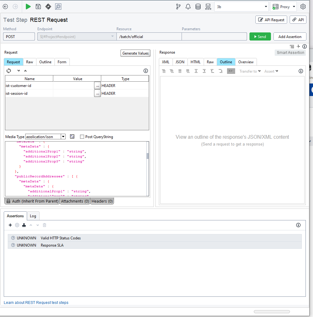
Now after the changes this assertion tab takes up about 25-30% of the of the application space and where i normally have one or two assertions like SLA and HTTP STATUS means 80% of the allocated assertion tab space is always empty
This means that 20% of my screen is just empty space and there is no fast like double click to minimize or a button to minimize this so instead i have to over and over again drag the tab to minimize the view so that i can actually see the request and/or payload where 90% of my work is done.
Is it just me that have issues with this or does everyone else love this change?
Picture below on how it looks for me by default
Thank you for the feedback TwoFang and JoostDG !
Feel free to create feature improvement requests here for our Product Team to monitor!
