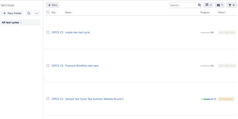
Zephyr Scale - Space between test cases/plans/cycles in list view
The system's displaying the test cases, test plans, and test cycles with a ton of white space above and below each item. Is there some piece of data we've entered into the system that's causing this? It seems like it's trying to make the items fill the space in the browser. So the more items there are, the more compact the rows become, and vice versa. This view makes it hard to navigate the items.1.3KViews1like4Comments
