Could Zephyr - Regression issue: Some text formatting in the test steps is no longer functional
Text formatting that used to work in test steps of Zephyr (local server version) is not functional in the cloud version. Examples that used to work: - Miscellaneous syntax such as (!) or (i). - Code blocks - Status lines - 2nd or 3rd degree bullet points (they are now all flattened to a 1st degree) - "-" no longer works the same way "*" to create bullet pointsSolved1.3KViews0likes2CommentsCan I make the test details text area fields bigger?
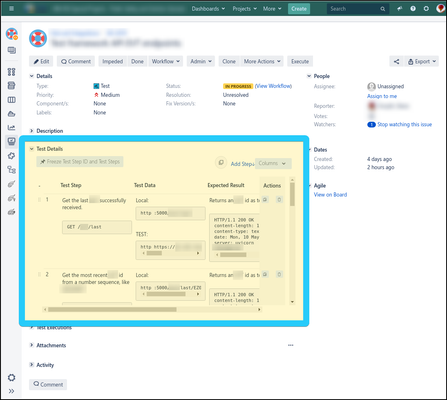
Hi all, I use Zephyr Squad 4.6.3 on Jira 7.13. When filling out test steps for a test, the "Test Details" section is quite small, and the text areas where I enter step information (test steps, test data, and expected results) are even smaller. I need to do a lot of mouse scrolling to read or update these fields, especially if I include a Jira "noformat" section. Below is a screenshot from my browser, showing the test details area highlighted in a blue rectangle. You can see that relative to the page itself, the area where I spend much of my time is quite small: I recently discovered the "Large View" icon, which does make the Test Details area bigger, but, disappointingly, not by much. Here's as screenshot of the same page from above, where the white rectangular area is the "Large View" overlay: While an improvement over the default view, it's still quite cramped, and I find myself still needing to do a lot of horizontal scrolling. Is there a better way? How do other people deal with this issue? Am I doing something wrong, or could it be that something in JIRA is causing the test details to be rendered unexpectedly small? Is there a different tool I could use to update test steps without using a browser, or perhaps a different way to edit or read test steps? I would love to hear if others have experienced this, and if so, how to make it easier to work with test steps. Thank-you! Little-Acorn1.4KViews2likes1Comment
