lphilippe_macau
13 years agoContributor
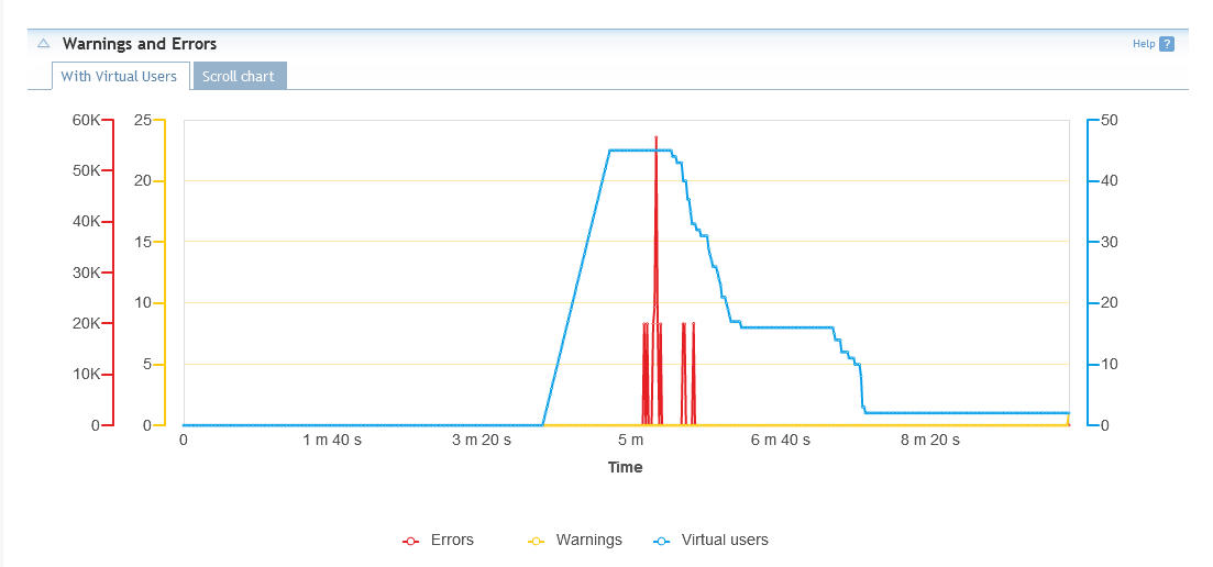
Report Graph Interpretation
Hi,
I'm just looking at a report from a basic load test that I have run. But the graph seems off... It would seem like I have 60 000 errors at one point during test but this could not be possible as I'm running very few users in this test (45 at peek).
Is it my interpretation of the "y" axis for errors that is wrong or is this correct?
I attached a screenshot of the actual graph.
Thanks for any input.
L-P
